






























Text & Titles
Text Reveal
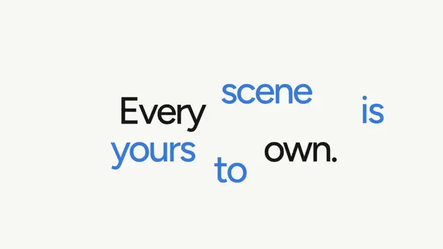
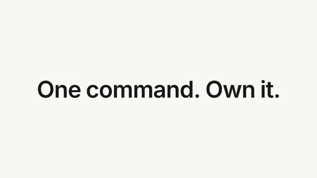
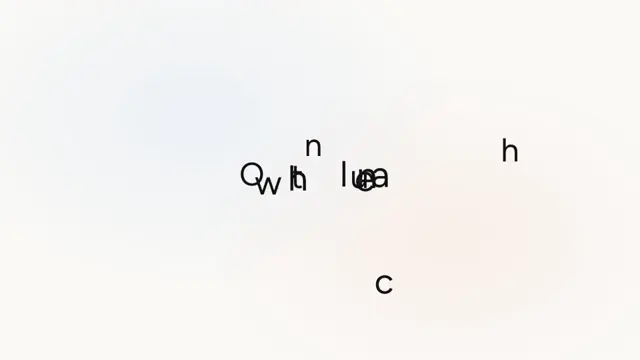
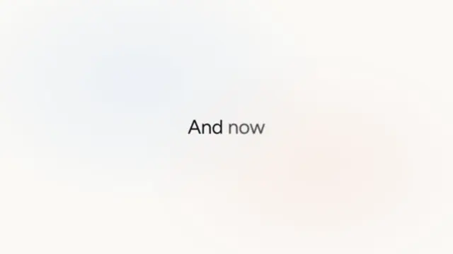
A cinematic zoom-out title reveal — the lead word appears large, then scales down and slides into place as the sentence sweeps in and settles
- Type
- Animation
- Duration
- 3.0s
- Category
- Text & Titles
- Source
- snapcn
Install
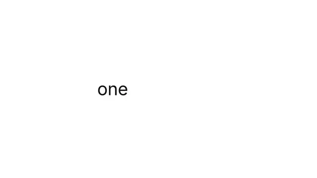
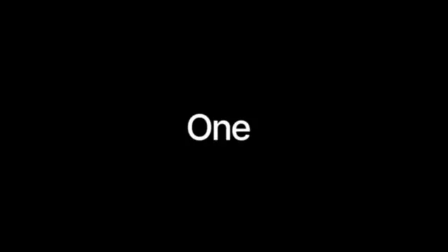
The reveal plays in four beats:
- The lead word fades in large and centred — right up against the viewer.
- It drifts a little closer still, and hangs there.
- It falls back to its final size, roughly in place.
- Only once it has landed does the line travel left, while the trailing words push in one by one from the right and settle.
Beats 3 and 4 begin on the same frame but run on very different clocks: the
recede is short, the slide is long and heavily eased in. That gap is what makes
the word read as going back first and moving left second, rather than doing
both at once — and the trailing words stay hidden until wordDelay frames into
the recede, so none of them appear while the lead word is still travelling.
Only scale, translate and opacity animate, so the baseline stays fixed and
nothing reflows.
Installation
$ pnpm dlx shadcn@latest add @snapcn/text-revealNeeds an existing Remotion project and a components.json. Two-minute setup if this is your first snapcn component.
Component code
The exact file shadcn add copies into your project.
Usage
// src/Root.tsx
import { Composition } from "remotion";
import { TextReveal } from "@/components/snap-cn/text-reveal";

const TitleScene = () => <TextReveal text="Meet Acme Billing" />;

export const RemotionRoot = () => (
  <Composition
    id="TextReveal"
    component={TitleScene}
    durationInFrames={90}
    fps={30}
    width={1280}
    height={720}
  />
);
Tune the feel with a few props — a bigger initialScale for a more dramatic
zoom, a longer assembleDuration for a slower settle:
<TextReveal
  text="Get more than you expect"
  initialScale={2.6}
  holdDuration={14}
  assembleDuration={40}
/>
The lead word's centre is measured once on mount so it stays perfectly centred while large and lands exactly in the line — the type, spacing and baseline never shift.
recedeDuration and assembleDuration are the two knobs that shape the reveal.
Keep the assemble comfortably longer than the recede (the default 30 vs 14 is a
good ratio); shrink the gap and the line starts sliding left while the lead word
is still falling back, which reads as one muddled move instead of two.
Props
| Prop | Type | Default | Description |
|---|---|---|---|
text | string | "Meet Acme Billing" | The sentence to assemble. Its first word leads the reveal |
fontSize | number | 72 | Final font size in px — the size the line settles at |
color | string | theme.foreground | Text color (any valid CSS color) |
fontWeight | number | string | 600 | CSS font-weight |
initialScale | number | 2.3 | How much larger the lead word starts (2 = twice the final size) |
pushScale | number | 1.06 | How far toward the viewer the lead word drifts during the hold (1.06 = 6% larger) |
introDuration | number | 6 | Frames the lead word fades in over at the very start |
holdDuration | number | 12 | Frames the lead word spends big and centred, drifting toward the viewer, before it falls back |
recedeDuration | number | 14 | Frames the lead word takes to fall back from its peak to its final size |
assembleDuration | number | 30 | Frames the line takes to slide left into place. Starts with the recede but runs well past it |
wordDelay | number | 7 | Frames after the recede begins before the second word pushes in |
wordStagger | number | 4 | Frames between each trailing word pushing in |
wordDuration | number | 14 | Frames a trailing word takes to push into its slot |
wordPush | number | 0.5 | How far right of its slot a trailing word starts, in em |
wordFade | number | 2 | Frames a trailing word fades in over — deliberately tiny, so the word reads as pushed into place rather than faded in |
letterSpacing | string | "-0.03em" | Resting letter-spacing (CSS value, em recommended) |
speed | number | 1 | Playback speed multiplier |
className | string | — | Optional className passed to the line element |
theme | Partial<SnapCnTheme> | — | Design-system token overrides. Anything you leave out falls back to the shadcn defaults |
mode | "light" | "dark" | — | Which end of the design system to resolve tokens against |
Frequently asked questions
How do I add Text Reveal to a Remotion project?
Run npx shadcn@latest add @snapcn/text-reveal. The source is copied into components/snap-cn/ (or wherever your components.json points) with anything it depends on, and you own the code from then on — there is no runtime package to keep installed.
What is Text Reveal?
Text Reveal is a Remotion word-by-word text reveal for React. A cinematic zoom-out title reveal — the lead word appears large, then scales down and slides into place as the sentence sweeps in and settles.
What do I need before using Text Reveal?
An existing Remotion project (npx create-video@latest) with a components.json. shadcn init does not recognise Remotion, so the installation guide has you write that file by hand — it takes two minutes. The component is MIT licensed and free.