














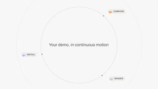











Scenes
Moodboard Reveal
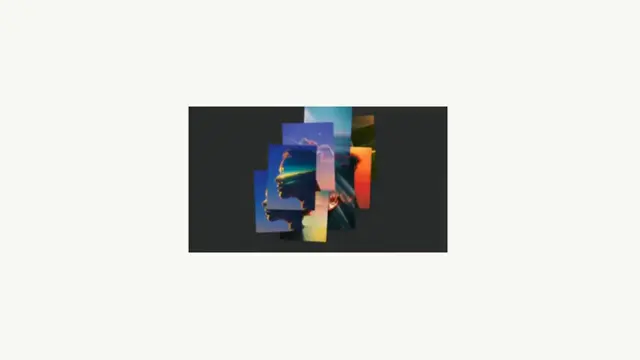
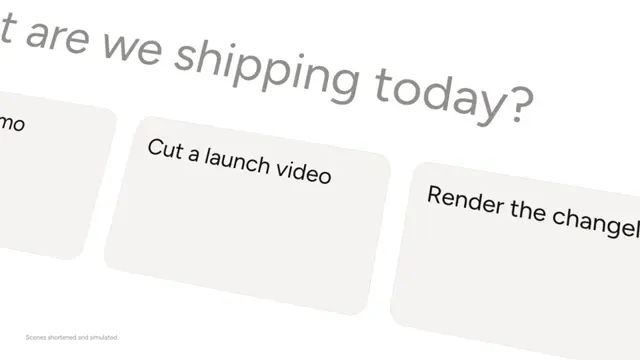
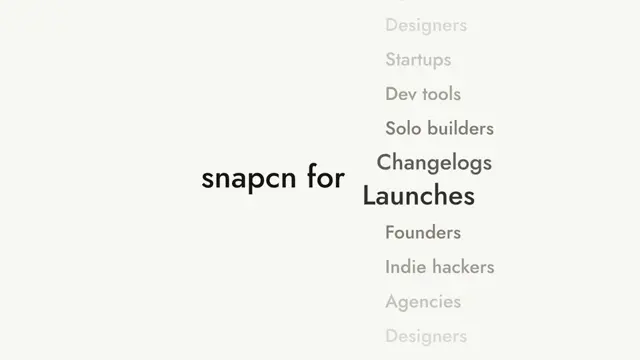
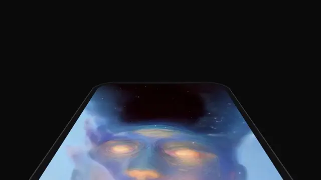
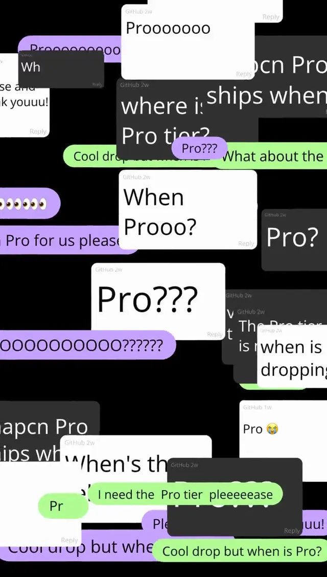
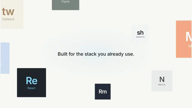
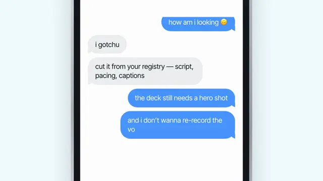
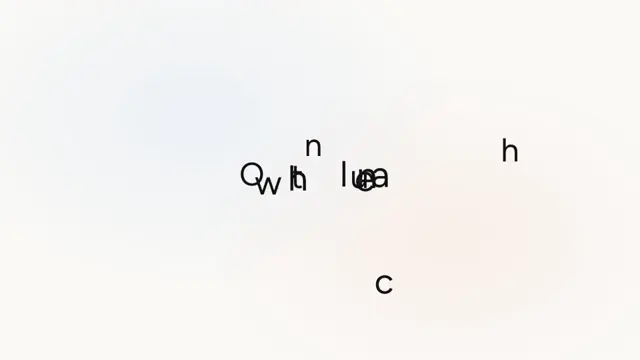
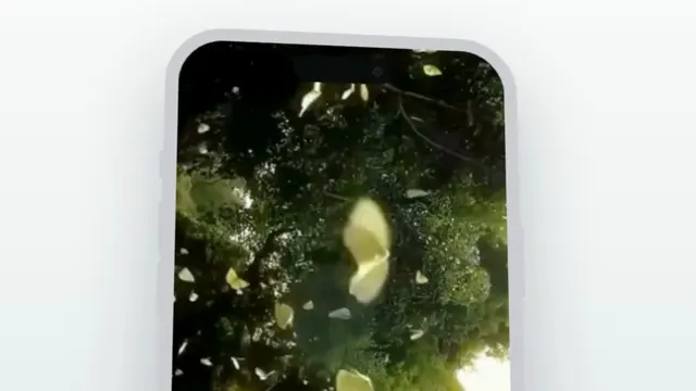
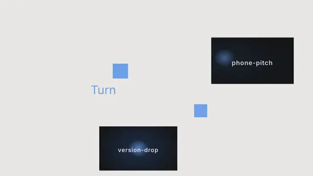
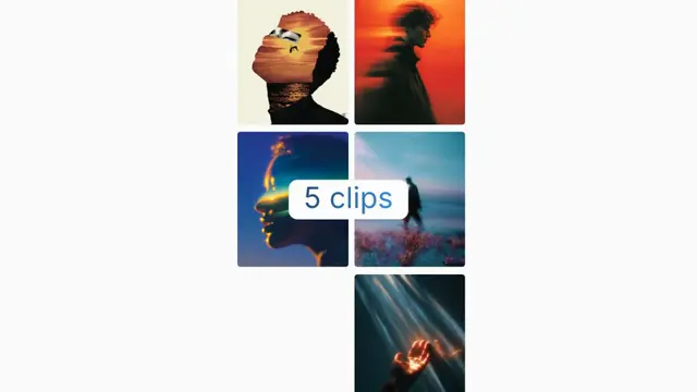
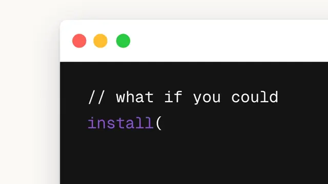
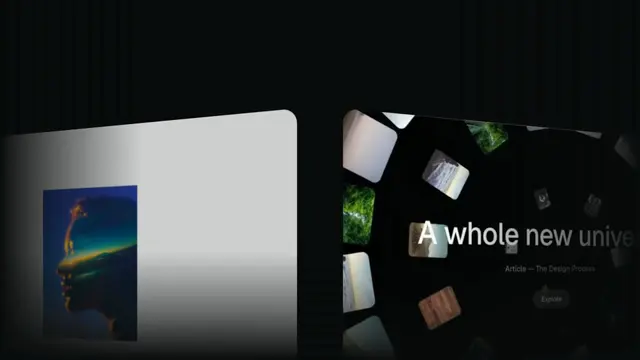
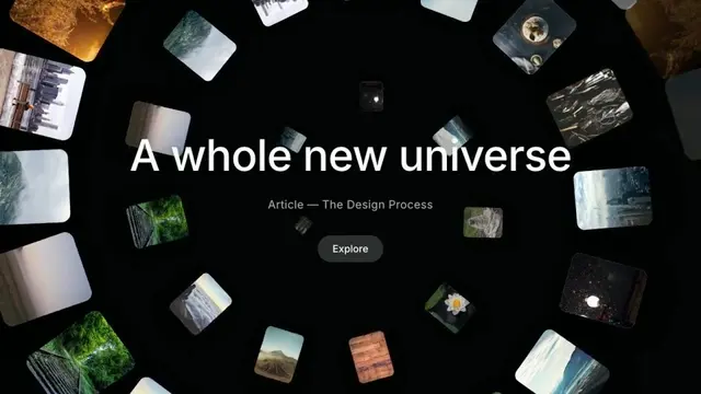
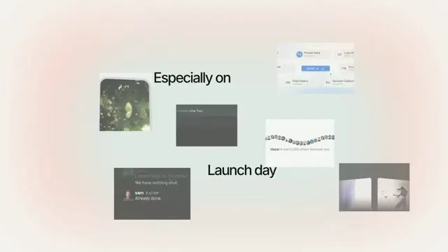
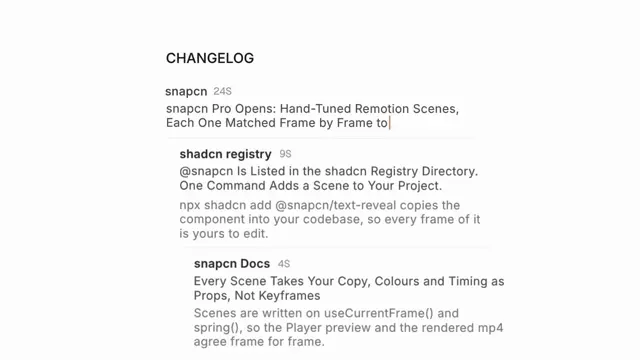
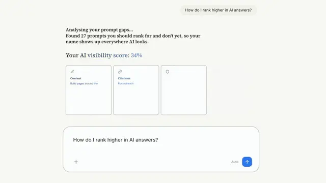
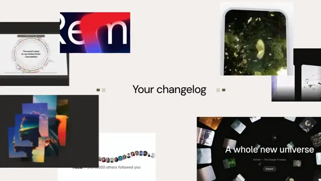
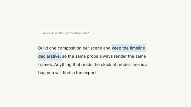
A kinetic headline with a swapping inline image, then a scattered photo gallery flies in and the camera pushes through it — dark to light — onto a hero image
- Type
- Animation
- Duration
- 5.0s
- Category
- Scenes
- Source
- snapcn
Install
Installation
$ pnpm dlx shadcn@latest add @snapcn/moodboard-revealNeeds an existing Remotion project and a components.json. Two-minute setup if this is your first snapcn component.
Component code
The exact file shadcn add copies into your project.
Usage
A four-beat, camera-drives-through montage:
- Headline —
<leadIn>· an inline image that swaps ·<emphasis>·<tailIn>, on a near-black dotted field. - Gallery — the image cards fly in and scatter into a moodboard.
- Push — the camera dollies through the gallery (with motion blur) while the background lifts from near-black to off-white.
- Hero — it lands on a single image, held to the end, with thin wireframe markers drifting.
Pass your own images (used for both the intro swap and the gallery) and a heroImage.
Everything is frame-driven, so scrubbing and rendering are deterministic.
// src/Root.tsx
import { Composition, staticFile } from "remotion";
import { MoodboardReveal } from "@/components/snap-cn/moodboard-reveal";

const Reel = () => (
  <MoodboardReveal
    leadIn="that lets you"
    emphasis="filter"
    tailIn="out AI."
    images={[
      staticFile("showcase-assets/438b9e6b50654a44d404fbf358c26e9f.webp"),
      staticFile("showcase-assets/821d815affa6496c39cbdeeec7a84603.jpg"),
      // …up to 8 look best
    ]}
  />
);

export const RemotionRoot = () => (
  <Composition
    id="MoodboardReveal"
    component={Reel}
    durationInFrames={150}
    fps={30}
    width={1280}
    height={720}
  />
);
Images take a root-relative /… path (served by Next in the Player, rewritten through
staticFile() in a render) or an http(s)/data URL. Eight portrait images fill the
gallery cleanly; fewer are tiled across the slots.
This is a slow camera scale over the whole gallery, which a live <Player> mispaces on
a high-refresh display — so the docs preview plays the rendered mp4. Re-render after
any change: pnpm run render:previews --only moodboard-reveal.
Props
| Prop | Type | Default | Description |
|---|---|---|---|
leadIn | string | "that lets you" | Text before the inline swapping image |
emphasis | string | "filter" | The bold word right after the inline image |
tailIn | string | "out AI." | Text after the emphasised word |
images | string[] | — | Image URLs for the intro swap and the gallery. Defaults to the showcase assets |
heroImage | string | — | The image the montage lands on. Defaults to images[3] |
darkColor | string | dark theme background | Near-black starting background |
lightColor | string | light theme background | Off-white ending background |
speed | number | 1 | Global playback multiplier applied to the whole sequence |
className | string | — | Optional className passed to the outer wrapper |
theme | Partial<SnapCnTheme> | — | Design-system token overrides. Anything you leave out falls back to the shadcn defaults |
mode | "light" | "dark" | — | Which end of the design system to resolve tokens against |
Frequently asked questions
How do I add Moodboard Reveal to a Remotion project?
Run npx shadcn@latest add @snapcn/moodboard-reveal. The source is copied into components/snap-cn/ (or wherever your components.json points) with anything it depends on, and you own the code from then on — there is no runtime package to keep installed.
What is Moodboard Reveal?
Moodboard Reveal is a Remotion moodboard animation for React. A kinetic headline with a swapping inline image, then a scattered photo gallery flies in and the camera pushes through it — dark to light — onto a hero image.
What do I need before using Moodboard Reveal?
An existing Remotion project (npx create-video@latest) with a components.json. shadcn init does not recognise Remotion, so the installation guide has you write that file by hand — it takes two minutes. The component is MIT licensed and free.