




Text & Titles
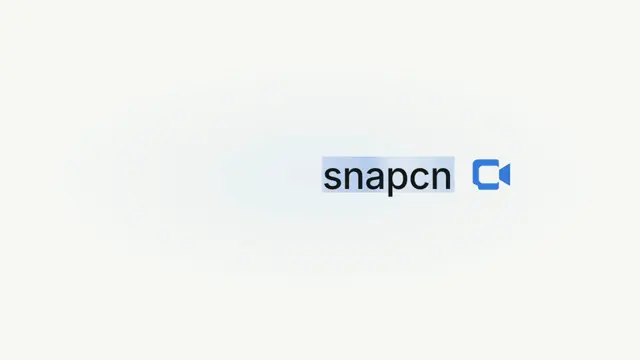
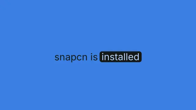
Text Highlight
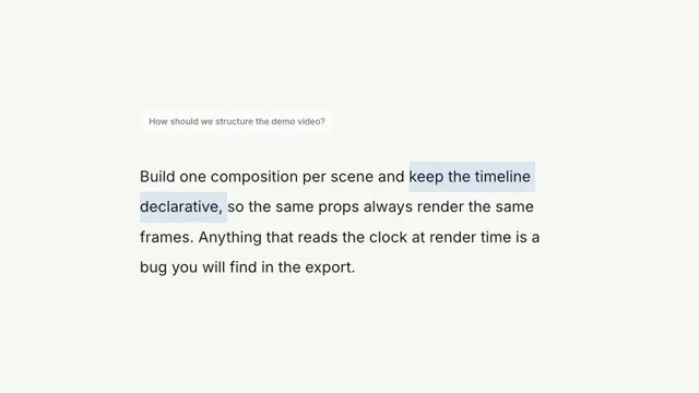
Animated emphasis on one span inside a static sentence — marker, color, underline, strikethrough, or shimmer
- Type
- Animation
- Duration
- 1.9s
- Category
- Text & Titles
- Source
- snapcn
Install
Installation
$ pnpm dlx shadcn@latest add @snapcn/text-highlightNeeds an existing Remotion project and a components.json. Two-minute setup if this is your first snapcn component.
Component code
The exact file shadcn add copies into your project.
Usage
// src/Root.tsx
import { Composition } from "remotion";
import { TextHighlight } from "@/components/snap-cn/text-highlight";

const TextHighlightScene = () => (
  <TextHighlight
    before="Close your books "
    highlight="10x faster"
    after=" with Initech Ledger"
    preset="marker"
  />
);

export const RemotionRoot = () => (
  <Composition
    id="TextHighlight"
    component={TextHighlightScene}
    durationInFrames={120}
    fps={30}
    width={1280}
    height={720}
  />
);
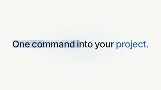
Unlike text-reveal components, the copy is fully visible from frame one — only the emphasis on the highlighted span animates in.
Presets
marker— a translucent accent marker block (16% tint ofaccentColor) sweeps behind the span with a high-damping spring, so the text underneath stays readable.color— the span's text color crossfades frombaseColorto the accent (orhighlightedTextColor).underline— an accent underline ofthicknesspx draws left-to-right beneath the span.strikethrough— an accent line draws across the span, then it crossfades intoreplaceWithand holds.shimmer— ashineColorgradient sweeps across the span via background-clip text.
How logo-wipe works
The wipe is a clip, not a fade. The mark rides an edge across the word, and
everything to the right of that edge exists. So the letters arrive already solid,
the way a lid sliding off a thing reveals it — and they appear right-to-left,
because the edge is travelling left. The whole reveal is expressed in percentages
of the word's own box (clip-path for the letters, left: % for the mark), so
nothing has to be measured and it works at any font size or string length.
The rush is perspective, not easing. The mark does not grow on a ramp — it
travels toward the eye, and its apparent size goes as 1 / (1 - travel). It creeps
for most of the trip and then blows up at the end, which is the whole character of a
thing coming at your face and is not something a curve can fake.
The rush is a swing, and the swing is built in world space. The mark does not come down the lens in a straight line — it leaves the lockup, arcs wide to the left, comes round, and passes you on the right. A semicircle from the screen to your eye.
The part that matters is where the curve is authored. The lateral path is a world-space crossing with a bow pulled out of it, and the projection multiplies it by the apparent scale. That single multiply is the whole effect: the same world path is a nudge while the mark is far away and a whip across the frame once it is at the lens, because that is what an arc coming at your face does — it opens up as it arrives. Author the offset in screen pixels instead and no curve you pick will fix it; you get a shape sliding around on glass, in front of the scene rather than through it.
It turns, and turning is not doubling back. A pendulum at the end of its swing has not changed its mind — it is still going, and the instant its sideways speed passes through nought it is coming at you faster than ever. What you must never do is take the mark off one way and then send something else back the other.
The colour comes out of the mark. Not in from an edge. That distinction is the whole ending, and it is forced by geometry rather than taste: the frame has to end flat, so the colour has to close over the left of the frame while the mark is travelling right, and there are exactly two ways to get it there. Something sweeps leftwards across the screen — a wall, a wipe, a roller — which is a second momentum pulling against the first, and it reads as paint being rolled on by an off-stage hand. Or the mark is already lying over that ground when its ink spreads.
This is the second job the bow does, and the reason it is not decoration. Because the mark swings left first, it is still left of centre at the moment it is big enough to go off — lying right across that half of the frame. So the ink is born on the left and opens out to the right, following the mark out. Take the bow away, send the mark straight down the lens, and the ink has to close leftward against the direction of everything else in the shot. Which is what it did, and it looked like paint.
The size is the other half of it: at 42× the mark's arms are past all four corners by the time the ink moves, so what closes the frame is the gaps between them filling in.
So the last beat is the mark's ink flooding out of it — a hard-edged disc of
coverColor, born inside the mark's own centre knot where it cannot be seen, that then
outruns it. Three things about it are load-bearing:
- It is a shape, not an opacity. Fading a full-frame rectangle up to opaque leaves a half-transparent wash lying over the backdrop for several frames, and there is no reading of that except "the screen faded to blue".
- It is keyed to the mark's size, never to the clock. It cannot begin until the mark is already frame-sized. On a timer it starts while the mark is small, and you get a blue screen with a little logo on it.
- It lags the mark. Ink is emitted, not carried: the mark punches ahead and its colour is left in the wake. Pin the disc to the mark and it flies out to the side with it, which drags the burst off-centre — and then the furthest corner of the frame is the one behind the mark, so the last thing on screen is a colour edge closing backwards, against the direction the whole shot is travelling.
A logo cannot cover the frame by growing, and that is a shape fact, not a tuning problem: scaling a mark scales its holes by exactly as much. Measured on the bundled clover, filling the frame with solid ink by scaling would take 396×. The ink is what closes them.
The wordmark does not fade out. The mark blows up straight through it and the ink takes what is left, so the word is erased rather than merely absent — and the frame is never empty, which is what fading it used to cost.
Set coverColor to "transparent" to skip the ink and end on the giant mark instead,
with the backdrop still showing through it.
If your logo is an image, it needs max-width: none
Tailwind's preflight sets img { max-width: 100% }, and it applies to img but
not to svg. The mark is placed in an absolutely-positioned box at left: 100%
(the word's right edge), where the width available to an auto-width box is
(containing block − left) = zero. Shrink-to-fit then asks the content for its
minimum width: an <svg width={58}> says "58" and holds the box open, but an image
capped at max-width: 100% says "I can be zero" — so the box collapses and the mark
renders zero pixels wide. A blank frame.
The component already opts out (max-width: none on the mark, width: max-content
on its box). It is called out here because it will not reproduce in a Remotion
render — a bundle has no preflight — so a component can be verified frame by frame
in an mp4 and still be invisible in the app that installs it.
Your own logo
Pass logoSrc (a URL — use staticFile() for your own public/), or logo (any
node; an SVG is better, because it scales forever). It goes through Remotion's
<Img>, so the frame waits for the image instead of rendering a hole.
Give it resolution. The rush blows the mark up to about 42× — a 300px PNG arrives as
mush. And set coverColor to your mark's colour if it is not accentColor, or the ink
will not match the mark it is supposed to be coming out of.
before and after are ignored by this preset: it is a lockup, not a sentence.
Props
| Prop | Type | Default | Description |
|---|---|---|---|
before | string | "" | Static copy rendered before the highlighted span |
highlightrequired | string | — | The span of text that receives the animated emphasis |
after | string | "" | Static copy rendered after the highlighted span |
preset | "logo-wipe" | "marker" | "color" | "underline" | "strikethrough" | "shimmer" | "logo-wipe" | Which emphasis animation to apply to the highlight |
baseColor | string | theme.foreground | Color of the surrounding copy (and the span before emphasis) |
accentColor | string | theme.primary | Accent used for the marker tint, underline, and strike line; the marker fill is a 16% alpha tint so text stays readable |
highlightedTextColor | string | — | Final color of the highlighted span. Defaults to accentColor for the color and strikethrough presets, baseColor otherwise |
replaceWith | string | — | Strikethrough only: the line draws over the first 40% of the emphasis window, the span crossfades to this text from 40–60%, then holds |
startAt | number | 6 | Frame at which the emphasis animation begins |
drawDuration | number | 14 | Frames the sweep/draw takes |
logo | React.ReactNode | — | logo-wipe only: the mark. Any node — an SVG is best, because it scales forever. Beats logoSrc; defaults to the snapcn mark in accentColor |
logoSrc | string | — | logo-wipe only: URL of a logo image, loaded through Remotion's <Img> so the frame waits for it. Use staticFile() for your own public/ |
logoScale | number | 1.05 | logo-wipe only: mark size as a multiple of fontSize |
spinTurns | number | 1 | logo-wipe only: turns the mark spins while it wipes the word open |
holdDuration | number | 12 | logo-wipe only: frames the finished lockup rests before the rush |
rushDuration | number | 24 | logo-wipe only: frames the rush at the camera takes. A perspective rush is back-loaded by nature — too few and the growth, the swing and the ink all land in the last three frames |
rushScale | number | 42 | logo-wipe only: the mark's size at the end of the rush, as a multiple of its resting size. Big enough that its own body overruns the frame, which is what lets the ink close the frame with nothing sweeping across it |
rushDrift | number | 0.55 | logo-wipe only: where the swing ends up, as a fraction of the width. Positive is right — across the frame and out past your shoulder. This is the crossing; swingOut is the arc |
swingOut | number | 0.25 | logo-wipe only: about how far the mark bows out to the left on the way, as a fraction of the width. This is what makes the rush a swing rather than a slide — and it is what leaves the mark lying over the left of the frame when its ink goes off, so the colour opens rightward behind it instead of closing backwards |
coverColor | string | accentColor | logo-wipe only: the colour the mark's ink floods out in, and the colour the frame ends on. Set it to your mark's own colour if it is not the accent, or "transparent" to end on the giant mark instead |
springConfig | { damping?: number; mass?: number; stiffness?: number } | { damping: 18 } | Spring for the marker and underline sweeps — high damping, no bounce |
thickness | number | round(fontSize * 0.08) | Underline/strikethrough line thickness in pixels |
shineColor | string | lighter of theme.card / theme.foreground | Shimmer only: color of the sweeping shine |
fontSize | number | 56 | Font size in pixels |
fontWeight | number | 600 | CSS font-weight |
speed | number | 1 | Playback speed multiplier |
className | string | — | Optional className passed to the sentence span |
theme | Partial<SnapCnTheme> | — | Design-system token overrides. Anything you leave out falls back to the shadcn defaults |
mode | "light" | "dark" | — | Which end of the design system to resolve tokens against |
Frequently asked questions
How do I add Text Highlight to a Remotion project?
Run npx shadcn@latest add @snapcn/text-highlight. The source is copied into components/snap-cn/ (or wherever your components.json points) with anything it depends on, and you own the code from then on — there is no runtime package to keep installed.
What is Text Highlight?
Text Highlight is a Remotion text highlight animation for React. Animated emphasis on one span inside a static sentence — marker, color, underline, strikethrough, or shimmer.
What do I need before using Text Highlight?
An existing Remotion project (npx create-video@latest) with a components.json. shadcn init does not recognise Remotion, so the installation guide has you write that file by hand — it takes two minutes. The component is MIT licensed and free.