























AI Chat Input
Search Typing
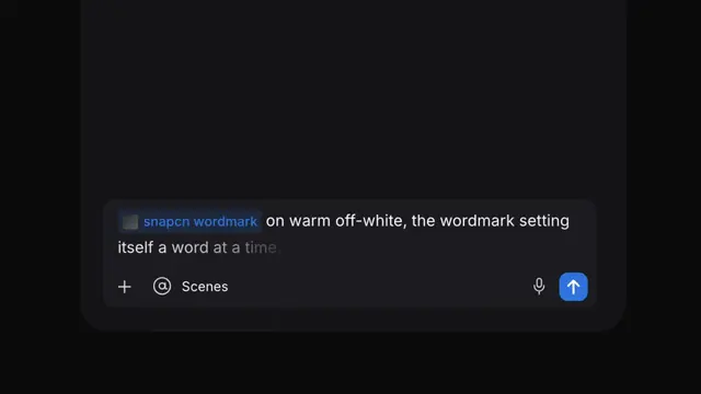
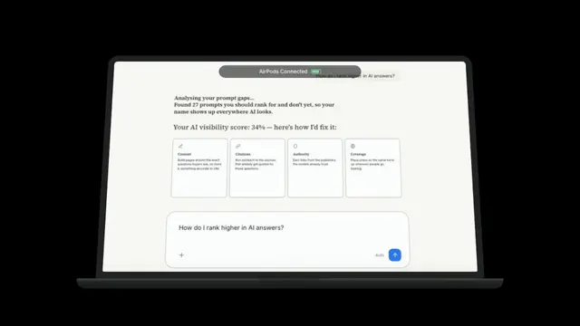
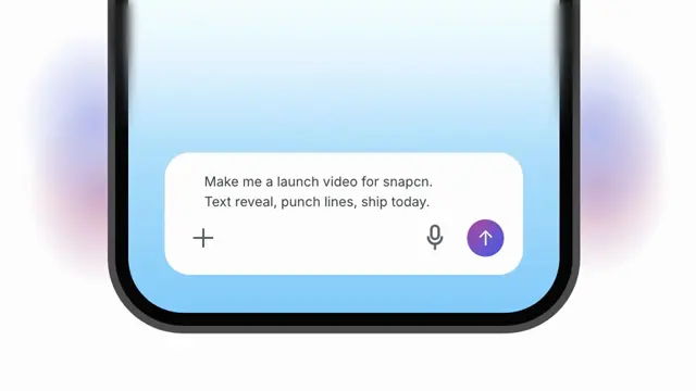
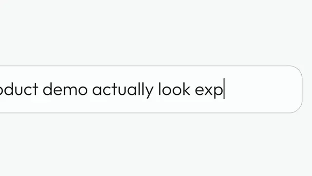
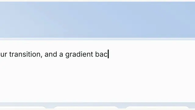
A search field wider than the shot — it comes forward, types across its left half, then pages to its right half
- Type
- Animation
- Duration
- 7.0s
- Category
- AI Chat Input
- Source
- snapcn
Install
Installation
$ pnpm dlx shadcn@latest add @snapcn/search-typingNeeds an existing Remotion project and a components.json. Two-minute setup if this is your first snapcn component.
Component code
The exact file shadcn add copies into your project.
Usage
Two thirds of the field are in frame to begin with, parked back. On the first keystroke it comes forward, and now only its left half fits. The sentence types across that half; when the caret runs out of frame the field slides, and its right half comes in. The sentence finishes there — and then the field goes back further than it started, far enough that the whole of it lands in frame, centred. That is the only moment in the clip you see the complete field and the finished sentence at once, so it is the shot the whole thing is built toward.
Everything is driven by the current frame, so scrubbing and rendering are deterministic — including the keystroke jitter, which is seeded, not sampled from a clock.
// src/Root.tsx
import { Composition } from "remotion";
import { SearchTyping } from "@/components/snap-cn/search-typing";

const AskScene = () => (
  <SearchTyping text="How do I make my product demo actually look expensive?" />
);

export const RemotionRoot = () => (
  <Composition
    id="SearchTyping"
    component={AskScene}
    durationInFrames={420}
    fps={60}
    width={1280}
    height={720}
  />
);
The component ships with a transparent background — place it over any backdrop, or over one of the Backgrounds.
The field is wider than the frame
That is the whole idea. fieldHeight sets how tall the field reads on screen (0.27 of the frame, so it comes out long and slim), and frontVisible sets how much of it is in frame once it has come forward. The field is then padded out to whatever length that framing needs.
That padding matters, and it is not a fudge. A field only as long as its sentence has a fixed aspect ratio — so demanding that half of it fill the frame would force its height, and it would come out as a chunky slab. Separating the two knobs is what lets it be both half-in-frame and slim. A real search field is longer than what you type into it anyway.
dolly is the ratio between the two depths — 1.25, which is what the reference measures. frontVisible × dolly is how much is in frame at rest: 0.56 × 1.25 ≈ two thirds.
The ending depth is not a third knob: it falls out of the geometry. The field retreats until it is exactly as wide as the page, so it fits — and because edgeInset leaves an equal margin either side, anchoring the retreat on the field's right cap lands it centred with no special case. The push and the retreat are therefore two separate moves to two separate depths (cameraPush, cameraRetreat), not one move played backwards. Folding them together is what kept the field from ever pulling back far enough to be seen whole.
The page across is not on a timer — it fires on the character whose caret is about to run out of frame, which falls near the middle of the sentence. It fires a little early on purpose: the pan eases in, so for its first frames the field has barely moved while the typing carries the caret on rightwards. Fire it at the edge and the caret spills over before the field catches up. Short sentences that fit in the first half never pan at all.
Proportions
Every measurement is a ratio of the field's height, so the whole thing scales as one piece. They are not invented: they come off the reference frames.
| ratio of field height | |
|---|---|
| corner radius | 0.276 — not a pill; a pill would be 0.500 |
| font size | 0.379 (cap height 0.265) |
| left cap → first glyph | 1.024 |
| left cap → icon | 0.357; icon 0.378 |
| caret | 0.024 wide × 0.434 tall |
The face is Outfit Light (300), loaded through @remotion/google-fonts so the Player, the rendered mp4 and your own project all get the same one. It was chosen by measurement, not by eye: the reference's stem-to-cap ratio is 0.121, and Outfit 300 is the geometric face that lands on it.
The surface is the design system's, not the reference's
The proportions above are measured. The colours are not — they were the
reference's brand. The field paints itself from inputStyleContext(), the very same
style context the shadcn <Input> uses, so it is a card surface on a hairline
border and it cannot drift away from the input sitting next to it in your app.
That matters most for the shadow. The reference's field carries a heavy drop shadow
and a grey-crown gradient. On its dark violet backdrop those read as depth and as
glass; on a light page they read as a grey smear and an inner shadow. So the
default carries no shadow at all — a flat #FFFFFF card and a #E4E7EC hairline
border, which is how shadcn defines a control. surface="glass" keeps the measured
reference field; use it only over something dark.
Why the type doesn't judder as it scales
A browser gives glyph origins no vertical sub-pixel precision at all — it rounds them to a whole device pixel. So a scale that moves the baseline makes the type climb the pixel grid in whole-pixel jumps: sit still, jump, sit still. So the scale pivots on the baseline, which is measured (a zero-sized inline-block sitting on it), never guessed from a line-height. On the rendered frames the baseline holds to a single pixel row across the full 1.25× sweep.
Separately, hinting bends each glyph so its stems land on whole pixels, and under a sliding scale they re-snap every frame — the letterforms boil. text-rendering: geometricPrecision turns that off.
will-change: transform is gated on getRemotionEnvironment().isRendering: right for the Player (one long-lived tab, a hard frame budget), wrong for a render (parallel tabs each inherit a stale raster).
Why the text doesn't shift as it types
The obvious way to type a string is text.slice(0, n). That re-shapes the run every keystroke, and a run that re-shapes can re-kern — settled glyphs twitch as new ones land. Instead the sentence is laid out once, in full, and revealed by clipping to a measured character boundary. A run shaped once cannot move a glyph. Ligatures are off, so the clip can never bisect an "fi".
The measurement runs once, behind delayRender(), after document.fonts.ready — and with the camera transform switched off, because getBoundingClientRect() reports device px and would otherwise hand back every advance multiplied by the current scale.
Props
| Prop | Type | Default | Description |
|---|---|---|---|
textrequired | string | — | The sentence typed into the field, one character at a time |
charsPerSecond | number | 14 | Typing speed. 14 is what the reference does |
humanize | number | 0.35 | Keystroke-interval variance, 0–1. 0 is a metronome. Deterministic — seeded, never sampled from a clock |
wordPause | number | 1.55 | Beat after a space, as a multiple of the base keystroke interval |
punctuationPause | number | 2.2 | Beat after . , ! ? ; : as a multiple of the base keystroke interval |
startDelay | number | 0.5 | Seconds the field holds, parked and blinking, before the first keystroke |
dollyDuration | number | 0.8 | Seconds the field takes to come forward once typing starts |
panDuration | number | 0.5 | Seconds the field takes to slide from its left half to its right half |
holdAfter | number | 0.9 | Seconds the finished sentence holds at the front before the field goes back |
recedeDuration | number | 1.2 | Seconds the field takes to travel back. It goes back further than it started — far enough that the whole field lands in frame. 0 parks it at the front |
dolly | number | 1.25 | How much bigger the field gets coming forward — the ratio the reference measures. frontVisible × dolly is how much is in frame at rest |
fieldHeight | number | 0.27 | The field's height on screen as a fraction of the frame's. The knob that makes it read long and slim rather than chunky; the text is a fixed ratio of it and comes with it |
frontVisible | number | 0.56 | How much of the field is in frame once it has come forward. The field is padded out to whatever length that needs, so this and fieldHeight are independent |
edgeInset | number | 40 | Margin, in px, between the field's visible cap and the edge of the frame |
caretBlinksPerSecond | number | 1 | Blinks per second. 1 is the ~500ms-on/500ms-off of a real text field; 0 holds it solid |
caret | boolean | true | Render the caret at all |
surface | "shadcn" | "glass" | "shadcn" | shadcn: a flat card surface and a hairline border, no shadow — correct on a light page. glass: the reference's grey-crown-to-white field with its drop shadow, which is lit for a DARK backdrop and reads as an inner shadow plus a smear on a light one |
theme | Partial<SnapCnTheme> | — | Design-system token overrides — the same shape every snap-cn-ui component takes |
mode | "light" | "dark" | "light" | Which default token set to resolve against |
icon | "search" | "sparkle" | "none" | "search" | Glyph in the left of the field |
fontFamily | string | — | Overrides Outfit |
fontWeight | number | 300 | CSS font-weight. The reference measures as a Light |
seed | string | "search-typing" | Seeds humanize. Same seed, same performance, forever |
speed | number | 1 | Global playback multiplier applied to the whole sequence |
className | string | — | Optional className passed to the field |
Frequently asked questions
How do I add Search Typing to a Remotion project?
Run npx shadcn@latest add @snapcn/search-typing. The source is copied into components/snap-cn/ (or wherever your components.json points) with anything it depends on, and you own the code from then on — there is no runtime package to keep installed.
What is Search Typing?
Search Typing is a Remotion search bar animation for React. A search field wider than the shot — it comes forward, types across its left half, then pages to its right half.
What do I need before using Search Typing?
An existing Remotion project (npx create-video@latest) with a components.json. shadcn init does not recognise Remotion, so the installation guide has you write that file by hand — it takes two minutes. The component is MIT licensed and free.