





























AI Chat Input
Agent Steps
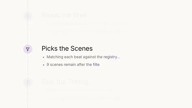
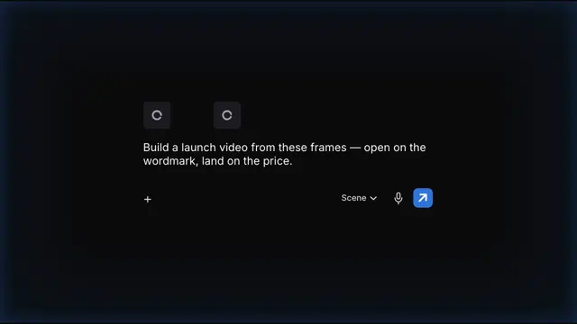
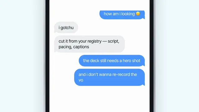
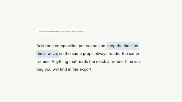
An agent narrating its own work — a log that writes itself one line at a time, always on the centre line, then swells and clears until only the answer is left
- Type
- Animation
- Duration
- 5.3s
- Category
- AI Chat Input
- Source
- snapcn
Install
Installation
$ pnpm dlx shadcn@latest add @snapcn/agent-stepsNeeds an existing Remotion project and a components.json. Two-minute setup if this is your first snapcn component.
Component code
The exact file shadcn add copies into your project.
Usage
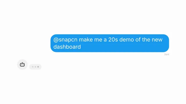
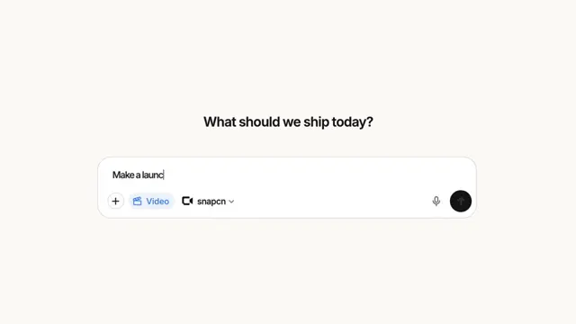
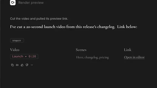
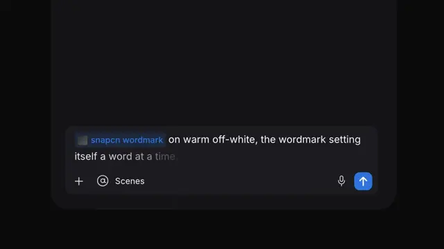
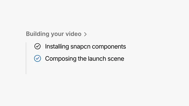
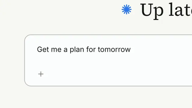
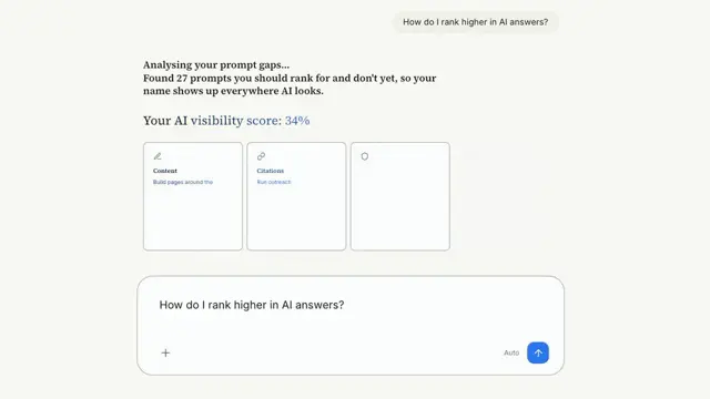
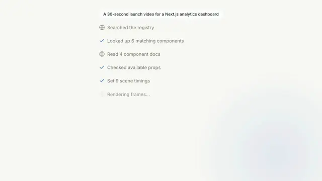
The prompt lands in a pill. Under it the log writes itself: each step arrives running — present tense, ellipsis, a faint globe turning beside it — and later flips to past tense behind a check, carrying whatever number it found. The whole column steps up one row every time a line is added, so the line that is still running is always the one on the centre of the frame.
When the work is done the column swells and clears, the surviving line slides to the middle of the frame, and the answer takes its place in a chip of its own.
// src/Root.tsx
import { Composition } from "remotion";
import { AgentSteps } from "@/components/snap-cn/agent-steps";

const Working = () => (
  <AgentSteps
    query="A 30-second launch video for a Next.js analytics dashboard"
    steps={[
      { running: "Searching the registry…", done: "Searched the registry", icon: "globe" },
      { running: "Reading the docs…", done: "Read 4 component docs", icon: "globe" },
      { running: "Building the timeline…", done: "Set 9 scene timings" },
      { running: "Rendering frames…", done: "Rendered frames" },
    ]}
    result="Rendered 900 frames"
  />
);

export const RemotionRoot = () => (
  <Composition
    id="AgentSteps"
    component={Working}
    durationInFrames={160}
    fps={30}
    width={1280}
    height={720}
  />
);
The last step never finishes
That is the whole structure, not an oversight. Every step but the last one runs for its hold and then flips to done; the last one is still running when the column clears, and the result chip is what it turns into. Write it in the present tense ("Rendering frames…") and put the number in result ("Rendered 900 frames") — the payoff is the moment the sentence completes.
There is no gap to tune between one step finishing and the next appearing: the next line is the acknowledgement that the last one finished, so it enters on the very next frame. That is what the reference does, frame for frame, and a pause between the two reads as a stall.
The column is bottom-anchored, not top-anchored
Rows stack downwards but the column hangs from its last row, which sits on centerY. So the list grows upward out of the frame rather than downward into empty space, and the live line never moves. The travel is one ROW_PITCH per step on a cubic-bezier(.3,.7,.3,1) over 0.308s, and it is additive: if two steps land inside one travel, the column carries both moves at once instead of interpolating between row indices — which is the difference between a list that keeps up with a fast agent and one that stalls and then jumps.
Proportions
Every measurement is a fraction of the composition height, so the whole thing scales as one piece. They come off a 718×398 screen recording, and none of them are eyeballed.
| fraction of frame height | measured | |
|---|---|---|
| row pitch | 0.0738 | 29.39px, from six consecutive settle positions agreeing to 0.07px |
| query pill height | 0.0553 | 22.0px, by the mass of its fill, not by its edges |
| corner radius | 0.28 of pill height | not a pill; a stadium would be 0.500 and sits 3.5px wrong |
| result pill height | 0.0691 | 27.5px — the answer gets a bigger chip than the question |
| icon box | 0.0314 | 12.5px, derived from drawn ink, since a lucide glyph does not fill its box |
| step type | 0.0254 | 10.11px |
| prompt type | 0.878 × step type | the prompt is set smaller than the log it starts |
The prompt being the smaller type is the one that looks like a mistake and is not. It falls out of a cross-correlation of the reference's column ink against this component's own render under a horizontal scale sweep: three separate step labels peak at 0.882, 0.868 and 0.887, and the prompt at 0.772. The same ratio shows up independently in the two strings' widths. A prompt has to survive one line in its pill; a step label never gets long enough to care.
Why the measurements are mass, not edges
A Gaussian blur moves an edge crossing but conserves an integral. The reference is a compressed recording of 10px type with a soft edge either side of every shape and a faint shadow under the pill, so every distance-between-two-edges came out wrong in a different direction each time. The pill height is therefore measured as the mass of its fill over a column band clear of both the type and the corner radius, and the icon strokes are fitted on ink — the one thing a blurred 12px glyph still reports honestly. Lucide's default stroke-width of 2 puts 34% more ink on the globe than the reference carries, which at this size is the difference between an icon and a dark blob.
The running step's icon is nearly invisible
RUNNING_ICON is 0.17, and that is measured too: the reference's spinner carries 850 of ink where its finished globe carries 5110. A running step is a place in the list, not a thing to look at — the moment it finishes, its icon is what tells you. The globe turns while it runs, and only its meridian turns: spinning the whole glyph would spin the equator with it and read as a wheel rather than a sphere.
The label, on the other hand, is not dimmed while it runs. The reference's running and done labels carry the same ink per glyph.
The outro is two lengths, not one
The column swells to 1.40× and fades, and the surviving row slides to the middle. Both curves are cubic-bezier(.3,0,.3,1), fitted separately at rms 0.017 and 0.015 — and they are deliberately not the same length. The swell finishes in 0.5s, the slide in 0.6s: the row is already at its final size while it is still travelling, so the last thing that moves is the thing you are meant to read.
The slide needs no DOM measurement. The row is wrapped in an element as wide as the column and the pair carry translateX(+50%) and translateX(-50%) — percentages of two different widths — so the row's centre lands on the column's centre whatever the copy is.
The surface is the design system's, not the reference's
The proportions above are measured. The colours are not — they were the reference's brand. The page is theme.background, the pills are theme.card, the log is theme.mutedForeground, the checks and the glint are theme.primary, and the wash in the corner is mixOklch(background, primary, 0.17) — a tint of the page, never a second colour on it. Override any of them per-prop, or the lot through theme.
Props
| Prop | Type | Default | Description |
|---|---|---|---|
query | string | "A 30-second launch video for a Next.js analytics dashboard" | The prompt, in the pill at the top |
steps | AgentStep[] | string | — | The log, in order. Each entry is { running, done, icon?, hold? }. Also accepts one string for quick edits: "running > done @globe; running > done" |
result | string | "Rendered 900 frames" | The answer the last step turns into |
queryHold | number | 0.683 | Seconds the prompt holds alone before the first step |
stepHold | number | 0.45 | Default seconds a step runs, for steps that do not set their own hold |
finalHold | number | 0.283 | Seconds the last step runs before the column starts to clear. It never flips to its done label — the result replaces it |
paperColor | string | — | Page behind the scene. Defaults to theme.background |
glowColor | string | — | The wash in the corner. Defaults to mixOklch(paper, primary, 0.17) |
glowX | number | 0.858 | Wash centre, as a fraction of frame width |
glowY | number | 0.854 | Wash centre, as a fraction of frame height |
glowRadius | number | 0.465 | Wash radius, as a fraction of composition height. 0 turns it off |
pillColor | string | — | Pill fill. Defaults to theme.card |
inkColor | string | — | Prompt and result ink. Defaults to theme.foreground |
stepColor | string | — | Step ink and the globe. Defaults to theme.mutedForeground |
accentColor | string | — | The completed check and the glint that crosses the result. Defaults to theme.primary |
centerY | number | 0.5 | The line the running step sits on, as a fraction of frame height |
fontFamily | string | — | Overrides Inter |
theme | Partial<SnapCnTheme> | — | Design-system token overrides — the same shape every snap-cn-ui component takes |
mode | "light" | "dark" | "light" | Which default token set to resolve against |
speed | number | 1 | Global playback multiplier applied to the whole sequence |
Frequently asked questions
How do I add Agent Steps to a Remotion project?
Run npx shadcn@latest add @snapcn/agent-steps. The source is copied into components/snap-cn/ (or wherever your components.json points) with anything it depends on, and you own the code from then on — there is no runtime package to keep installed.
What is Agent Steps?
Agent Steps is a Remotion AI agent steps animation for React. An agent narrating its own work — a log that writes itself one line at a time, always on the centre line, then swells and clears until only the answer is left.
What do I need before using Agent Steps?
An existing Remotion project (npx create-video@latest) with a components.json. shadcn init does not recognise Remotion, so the installation guide has you write that file by hand — it takes two minutes. The component is MIT licensed and free.