






























Social Proof
Follower Rush
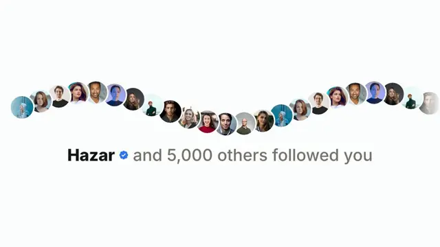
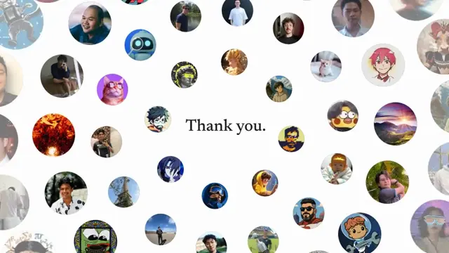
An X-style follower notification that piles up — avatars stack in and the count explodes, then the row bends into an undulating wave of faces
- Type
- Animation
- Duration
- 10.0s
- Category
- Social Proof
- Source
- snapcn
Install
Installation
$ pnpm dlx shadcn@latest add @snapcn/follower-rushNeeds an existing Remotion project and a components.json. Two-minute setup if this is your first snapcn component.
Component code
The exact file shadcn add copies into your project.
Usage
Built for the "we blew up" milestone beat. It opens as a single X-style notification — Manon ✓ followed you — then reorganizes into a stacked pile as more followers pour in: avatars pop on one by one and the count climbs slowly, then detonates from a couple dozen to the target. As it explodes the flat row bends into a travelling sine wave of faces that scrolls and undulates, with the lead name settling on the last follower and the count landing on the total.
// src/Root.tsx
import { Composition } from "remotion";
import { FollowerRush } from "@/components/snap-cn/follower-rush";

const Rush = () => (
  <FollowerRush totalFollowers={5000} orientation="horizontal" speed={1} />
);

export const RemotionRoot = () => (
  <Composition
    id="FollowerRush"
    component={Rush}
    durationInFrames={300}
    fps={30}
    width={1280}
    height={720}
  />
);
Props
| Prop | Type | Default | Description |
|---|---|---|---|
totalFollowers | number | 5000 | The number the count explodes up to and lands on — the pile grows exponentially and caps here |
followers | Follower[] | SAMPLE_FOLLOWERS | The crowd shown in the pile/wave — each is { name, avatarId }, where avatarId is a low GitHub user id for a CORS-safe avatar photo. Falls back to an initial-letter circle offline |
accentColor | string | theme.primary | Accent color — used for the verified badge and the leading new-follower icon |
mode | "light" | "dark" | "light" | Which end of the design system to resolve tokens against |
theme | Partial<SnapCnTheme> | — | Design-system token overrides. Anything you leave out falls back to the shadcn defaults |
orientation | "horizontal" | "vertical" | "horizontal" | Layout orientation — horizontal is 1280×720 (16:9), vertical is 720×1280 (9:16) letterboxed |
speed | number | 1 | Animation speed multiplier — minimum 1 so the timeline always reaches the wave |
Notes
- Exponential count: The total holds at 1 through the inline intro, then grows on an eased exponential — a slow crawl to a couple dozen, then a blow-up that lands exactly on
totalFollowers. - Flat pile → wave: Avatars overlap in a centred pile (leftmost on top, a page-coloured ring separating them), then bend into a travelling sine wave that scrolls; a single edge mask fades the wave's ends.
- Offline rendering: Avatars are real low-id GitHub photos (CORS-safe), each backed by an initial-letter circle, so the composition renders with no network and MP4 export needs no CORS setup.
- Live data ready: Pass your own crowd as
followersin the{ name, avatarId }shape; the lead callout name cycles through it and freezes on the last one.
Frequently asked questions
How do I add Follower Rush to a Remotion project?
Run npx shadcn@latest add @snapcn/follower-rush. The source is copied into components/snap-cn/ (or wherever your components.json points) with anything it depends on, and you own the code from then on — there is no runtime package to keep installed.
What is Follower Rush?
Follower Rush is a Remotion follower count animation for React. An X-style follower notification that piles up — avatars stack in and the count explodes, then the row bends into an undulating wave of faces.
What do I need before using Follower Rush?
An existing Remotion project (npx create-video@latest) with a components.json. shadcn init does not recognise Remotion, so the installation guide has you write that file by hand — it takes two minutes. The component is MIT licensed and free.