







Screens & Devices
Laptop Frame
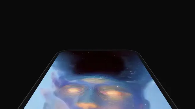
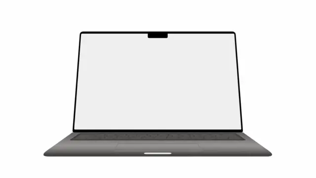
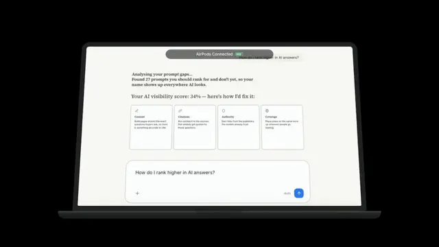
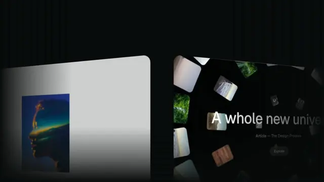
MacBook that opens, runs a notch notification, then dives into the screen until an image or video fills the frame
- Type
- Animation
- Duration
- 8.0s
- Category
- Screens & Devices
- Source
- snapcn
Install
Installation
$ pnpm dlx shadcn@latest add @snapcn/laptop-frameNeeds an existing Remotion project and a components.json. Two-minute setup if this is your first snapcn component.
Component code
The exact file shadcn add copies into your project.
Usage
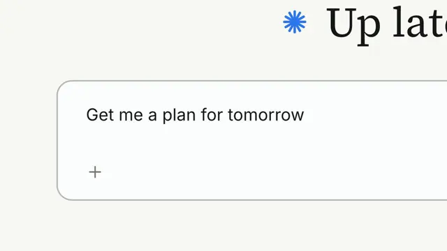
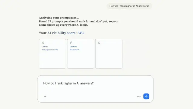
The lid opens, the notch runs its idle → connecting → connected notification, and then the camera dives into the screen — un-tilting it and scaling it up until the content fills the frame. Drop in a screenshot, a screen recording, or your own UI. Everything is driven by the current frame, so scrubbing and rendering are fully deterministic. The component ships with a transparent background; supply the backdrop from the scene.
// src/Root.tsx
import { Composition, staticFile } from "remotion";
import { LaptopFrame } from "@/components/snap-cn/laptop-frame";

const ProductScene = () => (
  <LaptopFrame
    entrance="open"
    finale="zoom-to-screen"
    screenSrc={staticFile("demos/answer-stream.mp4")}
    notchLabel="AirPods Connected"
  />
);

export const RemotionRoot = () => (
  <Composition
    id="LaptopFrame"
    component={ProductScene}
    durationInFrames={240}
    fps={30}
    width={1280}
    height={720}
  />
);
screenSrc takes an image or a video — a .mp4/.webm/.mov/.m4v plays through
<OffthreadVideo>, anything else through <Img>, both covering the screen and
fading in. Pass a staticFile() path (or a root-relative /… one) for a bundled
asset, or an http(s)/data URL. For full control, pass children instead. Omit
both and you get a built-in product-hero placeholder.
Entrances
rise— fades in while translating up 70px with a fast ease-out; the default launch look.open— the lid swings up from the deck (82° → rest tilt) as the machine fades in.none— appears already settled, for scenes that composite the laptop in some other way.
The screen takeover (finale)
finale="zoom-to-screen" is the payoff: from frame 140 the camera dollies into the
screen and flattens the lid to head-on (rotateX → 0), so by frame 185 the screen
content covers the whole frame and holds. The cover scale is derived from the
composition size, so it lands filling the frame exactly — this assumes the laptop
occupies the full composition. Set finale="none" to just leave the laptop sitting.
This is a slow scale on the whole screen over many frames, which a live <Player>
mispaces on a high-refresh display — so the docs preview here plays the rendered
mp4. Re-render it after any change: pnpm run render:previews --only laptop-frame.
The notch
The notch is a dynamic-island-style pill that morphs through three states: an idle
camera dot, three connecting dots, then the connected label with a battery. It lands
"connected" at frame 120 (then fades as the dive begins) — set showNotch={false}
for a plain lid, or change notchLabel and batteryLevel to suit the scene.
Props
| Prop | Type | Default | Description |
|---|---|---|---|
children | ReactNode | — | Screen content. Falls back to screenSrc, then the built-in hero placeholder |
screenSrc | string | — | Image or video (.mp4/.webm/.mov/.m4v → OffthreadVideo) to fill the screen; covers and fades in |
entrance | "rise" | "open" | "none" | "rise" | How the laptop enters the frame |
finale | "none" | "zoom-to-screen" | "none" | zoom-to-screen dollies the camera into the screen until the content fills the frame |
bezelColor | string | dark neutral from theme | Lid shell and deck base color (space-grey by default) |
screenColor | string | theme.card | Screen fill rendered behind the content |
restTilt | number | 18 | rotateX of the lid at rest, in degrees |
radius | number | 22 | Lid top-corner radius. Bottom corners stay near-square at the hinge |
shadow | string | derived from theme.background | CSS box-shadow under the deck. Empty string disables it |
scale | number | 0.95 | Uniform size multiplier for the whole machine (lid base 820 × 500) |
showNotch | boolean | true | Render the notch notification pill |
notchLabel | string | "AirPods Connected" | Text shown in the notch's connected state |
batteryLevel | number | 85 | Battery fill (0–100) drawn green in the connected state |
floatLoop | boolean | true | Gentle vertical bob after the entrance settles (5s period) |
floatAmplitude | number | 4 | Peak float displacement in pixels |
speed | number | 1 | Global playback multiplier applied to the whole sequence |
className | string | — | Optional className passed to the outer wrapper |
theme | Partial<SnapCnTheme> | — | Design-system token overrides. Anything you leave out falls back to the shadcn defaults |
mode | "light" | "dark" | — | Which end of the design system to resolve tokens against |
Frequently asked questions
How do I add Laptop Frame to a Remotion project?
Run npx shadcn@latest add @snapcn/laptop-frame. The source is copied into components/snap-cn/ (or wherever your components.json points) with anything it depends on, and you own the code from then on — there is no runtime package to keep installed.
What is Laptop Frame?
Laptop Frame is a Remotion MacBook mockup for React. MacBook that opens, runs a notch notification, then dives into the screen until an image or video fills the frame.
What do I need before using Laptop Frame?
An existing Remotion project (npx create-video@latest) with a components.json. shadcn init does not recognise Remotion, so the installation guide has you write that file by hand — it takes two minutes. The component is MIT licensed and free.