



































Scenes
Orbit Gallery
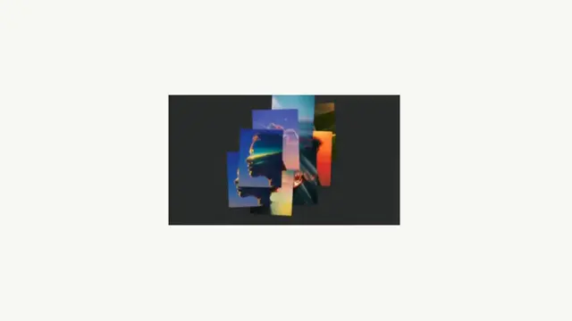
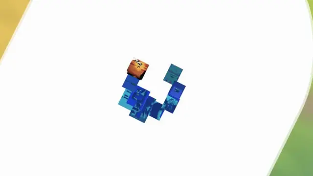
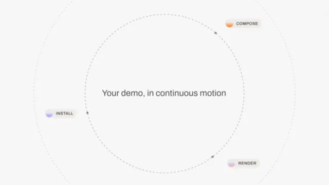
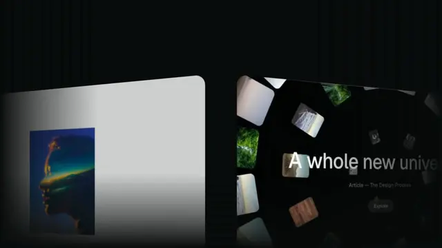
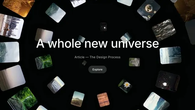
A ring of feature cards orbits a central product mark, each rotating upright as it swings to the front
- Type
- Animation
- Duration
- 10.0s
- Category
- Scenes
- Source
- snapcn
Install
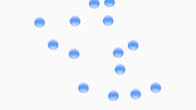
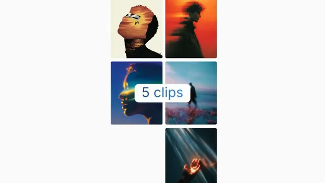
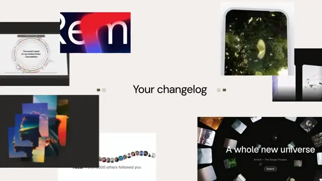
The editorial "universe" opener: a continuous stream of photos flows along an Archimedean spiral — a vortex seen from the top. Cards enter big at the frame edges (the outer coils overflow and clip), then wind inward, shrinking and rotating to follow the spiral's tangent until they vanish at the center. Because the spiral's radius falls off linearly, every coil is separated by the same gap — that even "circle to circle" spacing — and cards are placed by arc length, so they stay evenly spread instead of bunching near the middle. The center stays clear for the title.
Installation
$ pnpm dlx shadcn@latest add @snapcn/orbit-galleryNeeds an existing Remotion project and a components.json. Two-minute setup if this is your first snapcn component.
Component code
The exact file shadcn add copies into your project.
Usage
// src/Root.tsx
import { Composition } from "remotion";
import { OrbitGallery } from "@/components/snap-cn/orbit-gallery";

const Opener = () => (
  <OrbitGallery
    title="A whole new universe"
    subtitle="Article — The Design Process"
    buttonLabel="Explore"
    images={[
      "/gallery/01.jpg",
      "/gallery/02.jpg",
      "/gallery/03.jpg",
      // …cycled along the stream
    ]}
    footerLeft="Blur Effect"
    footerCenter="Template — 01"
    footerRight="YEAR 25"
  />
);

export const RemotionRoot = () => (
  <Composition
    id="OrbitGallery"
    component={Opener}
    durationInFrames={300}
    fps={30}
    width={1080}
    height={1920}
    defaultProps={{}}
  />
);
Works in any aspect ratio — the spiral radius derives from min(width, height),
so the vortex scales cleanly across portrait, square and landscape.
How the vortex is built
archimedeanPoint(n, R, turns) walks the spiral from the outer edge (n = 0,
radius R) to the center (n = 1, radius 0) — a linear radius, so the coils
are evenly spaced. buildArcTable / arcToN reparameterize the path by arc
length so cards sit at even visual intervals, and sizeScale shrinks each card
toward the middle. The stream then advances by whole card-steps per loop, so the
inward flow is seamless. Cards are sorted by depth (center on top) and rotated
to the spiral's tangent.
Props
images— artwork URLs, cycled along the stream. A URL that fails to load falls back to a gradient tile (playback never breaks). Pass[]to use the built-in editorial gradient tiles (no network requests).turns— coils from edge to center (default 3.5).spacing— arc gap between cards; smaller packs them tighter (default 5).spread— radius scale; larger pushes the outer coils further off-frame while keeping the coil gaps even (default 6).imageSize— card long-edge in px on the reference 600px canvas, scaled to your frame (default 200);sizeAttenuationcontrols the center shrink.cornerRadius— 0–20 rounding (default 5;0for perfectly square cards).orbitSeconds— seconds for one full inward turnover (default 40).title/subtitle/buttonLabel— the centered lockup; emptytitlehides it for a pure vortex.footerLeft/footerCenter/footerRight— tiny bottom captions.
Pairs well with a title opener as the establishing beat.
Frequently asked questions
How do I add Orbit Gallery to a Remotion project?
Run npx shadcn@latest add @snapcn/orbit-gallery. The source is copied into components/snap-cn/ (or wherever your components.json points) with anything it depends on, and you own the code from then on — there is no runtime package to keep installed.
What is Orbit Gallery?
Orbit Gallery is a Remotion orbit feature cards for React. A ring of feature cards orbits a central product mark, each rotating upright as it swings to the front.
What do I need before using Orbit Gallery?
An existing Remotion project (npx create-video@latest) with a components.json. shadcn init does not recognise Remotion, so the installation guide has you write that file by hand — it takes two minutes. The component is MIT licensed and free.