


































Screens & Devices
Phone Frame
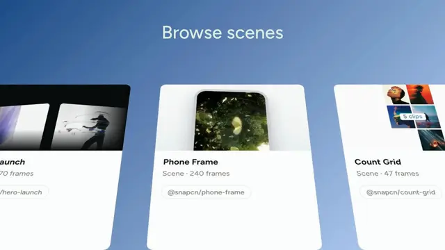
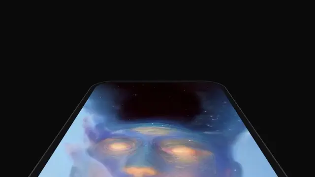
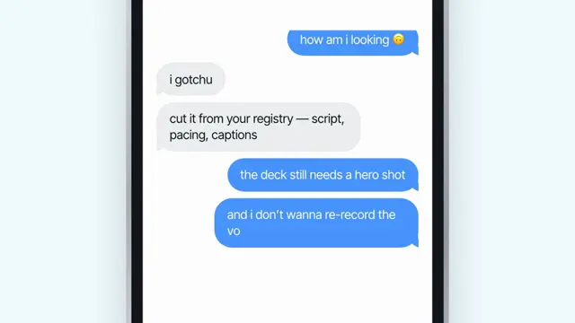
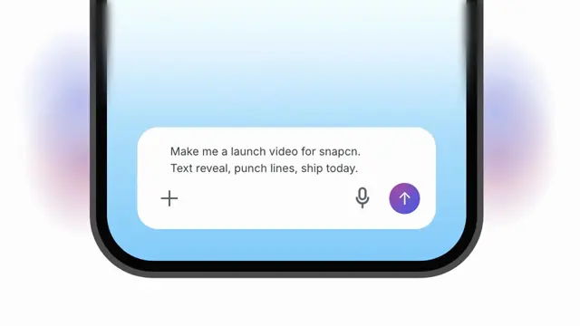
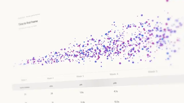
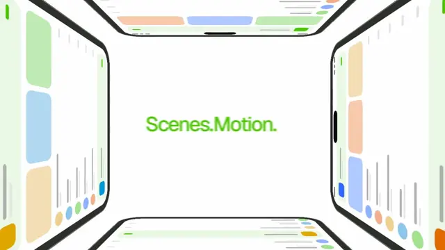
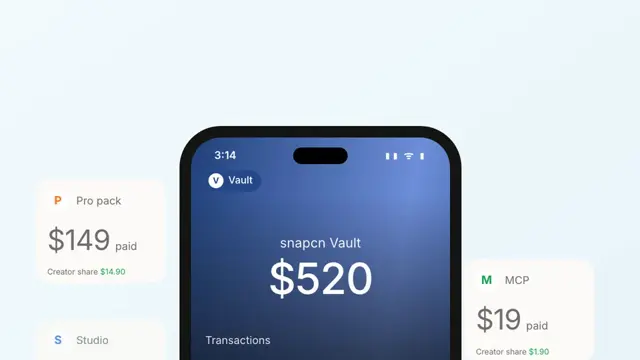
iPhone-style device frame with a dynamic island — sways in 3D showing off a glowing ride-summary map that draws itself
- Type
- Animation
- Duration
- 8.0s
- Category
- Screens & Devices
- Source
- snapcn
Install
Installation
$ pnpm dlx shadcn@latest add @snapcn/phone-frameNeeds an existing Remotion project and a components.json. Two-minute setup if this is your first snapcn component.
Component code
The exact file shadcn add copies into your project.
Usage
Drop any screen content into the frame — an app UI, an <OffthreadVideo> screen
recording, or an <Img> — and the device rises in over your backdrop, then keeps a
subtle float loop. Everything is driven by the current frame, so scrubbing and
rendering are fully deterministic. The component ships with a transparent
background; supply the backdrop from the scene (an ambient gradient works well).
// src/Root.tsx
import { Composition, staticFile } from "remotion";
import { PhoneFrame } from "@/components/snap-cn/phone-frame";

const AppLaunchScene = () => (
  <PhoneFrame
    variant="showcase"
    entrance="float"
    scale={0.9}
    screenSrc={staticFile("screen-recording.mp4")}
  />
);

export const RemotionRoot = () => (
  <Composition
    id="PhoneFrame"
    component={AppLaunchScene}
    durationInFrames={240}
    fps={30}
    width={1280}
    height={720}
  />
);
screenSrc takes an image or a video — a .mp4/.webm/.mov/.m4v plays through
<OffthreadVideo> (muted), anything else renders through <Img>, both cover-fit
to the screen. Omit both children and screenSrc to get the built-in
ride-summary placeholder — a dark map whose glowing GPS route draws itself while
stat "insight" pills pop in along it. On light scenes, keep the silver
bezelColor; on dark ones, pass mode="dark" and the shell follows the theme.
Unlike a desktop browser window, this is a portrait device with a real
dynamic-island cutout and a 3D tilt (tilt) or cinematic crane move (showcase)
for hero shots.
Variants
flat— faces the camera head-on.tilt— a static perspectiverotateY(seetiltAngle).showcase— a cinematic crane move: the camera starts low at the bottom-left corner of the laid-back device, sweeps up the screen while zooming in, then pulls back and settles on a straight frontal view. Normalized to the composition length, so it always completes.
Entrances
rise— fades in while translating up 70px with a fast ease-out; the default launch look.rotate-in— rises with a slight -8° in-plane rotation and a 0.94 → 1 scale settle.float— no travel: fades and grows from 0.96 in place, with the float loop running from frame 0.
Props
| Prop | Type | Default | Description |
|---|---|---|---|
children | ReactNode | — | Screen content. Falls back to screenSrc, then the animated ride-summary map placeholder |
screenSrc | string | — | Image or video URL to fill the screen when children is omitted. .mp4/.webm/.mov/.m4v play muted via OffthreadVideo, other sources render via Img; both cover-fit |
variant | "flat" | "tilt" | "showcase" | "flat" | flat faces the camera; tilt adds a static perspective rotateY (see tiltAngle); showcase runs the cinematic bottom-left → top → frontal crane move |
entrance | "rise" | "rotate-in" | "float" | "rise" | How the device enters the frame |
bezelColor | string | theme.foreground | Device shell color. Use #26272B on dark scenes |
screenColor | string | theme.card | Screen fill rendered behind the children |
radius | number | 53 | Outer body corner radius. Defaults to real-device curvature (16.5% of the body width) |
screenRadius | number | radius - 12 | Screen corner radius. Defaults to the concentric-corner rule: body radius minus the bezel width |
shadow | string | derived from theme.foreground | CSS box-shadow under the device. Empty string disables it |
scale | number | 1 | Uniform size multiplier for the whole device (base size 320 × 656) |
showDynamicIsland | boolean | true | Render the dynamic-island cutout over the screen |
floatLoop | boolean | true | Gentle vertical bob after the entrance settles (4.5s period) |
floatAmplitude | number | 6 | Peak float displacement in pixels |
tiltAngle | number | -12 | rotateY angle in degrees used by the tilt variant |
speed | number | 1 | Global playback multiplier applied to the whole sequence |
className | string | — | Optional className passed to the outer wrapper |
theme | Partial<SnapCnTheme> | — | Design-system token overrides. Anything you leave out falls back to the shadcn defaults |
mode | "light" | "dark" | — | Which end of the design system to resolve tokens against |
Frequently asked questions
How do I add Phone Frame to a Remotion project?
Run npx shadcn@latest add @snapcn/phone-frame. The source is copied into components/snap-cn/ (or wherever your components.json points) with anything it depends on, and you own the code from then on — there is no runtime package to keep installed.
What is Phone Frame?
Phone Frame is a Remotion iPhone mockup for React. iPhone-style device frame with a dynamic island — sways in 3D showing off a glowing ride-summary map that draws itself.
What do I need before using Phone Frame?
An existing Remotion project (npx create-video@latest) with a components.json. shadcn init does not recognise Remotion, so the installation guide has you write that file by hand — it takes two minutes. The component is MIT licensed and free.