


















































































Logos
Logo Flicker
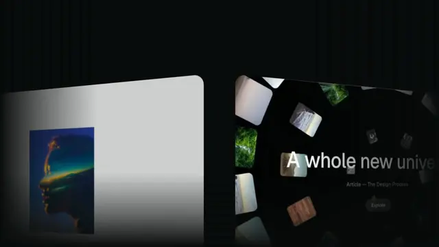
Images flip across the screen very fast, the flicker decelerates and fades, and the logo and brand name resolve underneath
- Type
- Animation
- Duration
- 3.3s
- Category
- Logos
- Source
- snapcn
Install
Installation
$ pnpm dlx shadcn@latest add @snapcn/logo-flickerNeeds an existing Remotion project and a components.json. Two-minute setup if this is your first snapcn component.
Component code
The exact file shadcn add copies into your project.
Usage
A Marvel-Studios-style flicker reveal:
- Flicker — the
imagesflip full-screen at a constant fast rate (one image perflipIntervalframes), right to the end — no slow-down. - Cross-fade — the flicker fades out while the logo and brand name fade in, on the exact same window — one move, not one after the other.
Pass your logoSrc (simple/monochrome) and brandName, and the images the flicker flips
through. Everything is frame-driven, so scrubbing and rendering are deterministic.
// src/Root.tsx
import { Composition, staticFile } from "remotion";
import { LogoFlicker } from "@/components/snap-cn/logo-flicker";

const Sting = () => (
  <LogoFlicker
    logoSrc={staticFile("logo/snapcn-white.png")}
    brandName="snapcn"
    images={[
      staticFile("showcase-assets/438b9e6b50654a44d404fbf358c26e9f.webp"),
      staticFile("showcase-assets/821d815affa6496c39cbdeeec7a84603.jpg"),
      // …a handful reads best
    ]}
  />
);

export const RemotionRoot = () => (
  <Composition
    id="LogoFlicker"
    component={Sting}
    durationInFrames={100}
    fps={30}
    width={1280}
    height={720}
  />
);
The flicker swaps the full-screen image every couple of frames, which a live <Player> shows as
harsh flashing before the browser has the images cached — so the docs preview plays the
rendered mp4. Re-render after any change: pnpm run render:previews --only logo-flicker.
Note: this is a fast full-screen image strobe. Raise flipInterval (slower flips) if you need it
gentler for photosensitivity.
Props
| Prop | Type | Default | Description |
|---|---|---|---|
logoSrc | string | "/logo/snapcn-white.png" | The logo mark, simple/monochrome, that resolves on the dark backdrop |
brandName | string | "snapcn" | Brand name shown under the logo |
images | string[] | — | The image pool the flicker flips through full-screen. Defaults to the showcase assets |
flipInterval | number | 2 | Frames each image holds — the (constant) flip speed. Larger = slower/gentler |
background | string | theme.background (dark) | Backdrop color |
speed | number | 1 | Global playback multiplier applied to the whole sequence |
className | string | — | Optional className passed to the outer wrapper |
theme | Partial<SnapCnTheme> | — | Design-system token overrides. Anything you leave out falls back to the shadcn defaults |
mode | "light" | "dark" | — | Which end of the design system to resolve tokens against |
Frequently asked questions
How do I add Logo Flicker to a Remotion project?
Run npx shadcn@latest add @snapcn/logo-flicker. The source is copied into components/snap-cn/ (or wherever your components.json points) with anything it depends on, and you own the code from then on — there is no runtime package to keep installed.
What is Logo Flicker?
Logo Flicker is a Remotion logo flicker intro for React. Images flip across the screen very fast, the flicker decelerates and fades, and the logo and brand name resolve underneath.
What do I need before using Logo Flicker?
An existing Remotion project (npx create-video@latest) with a components.json. shadcn init does not recognise Remotion, so the installation guide has you write that file by hand — it takes two minutes. The component is MIT licensed and free.